Resume Template Free Download – Display Your Initials, Core Skills & Industries
 Purpose of the résumé template
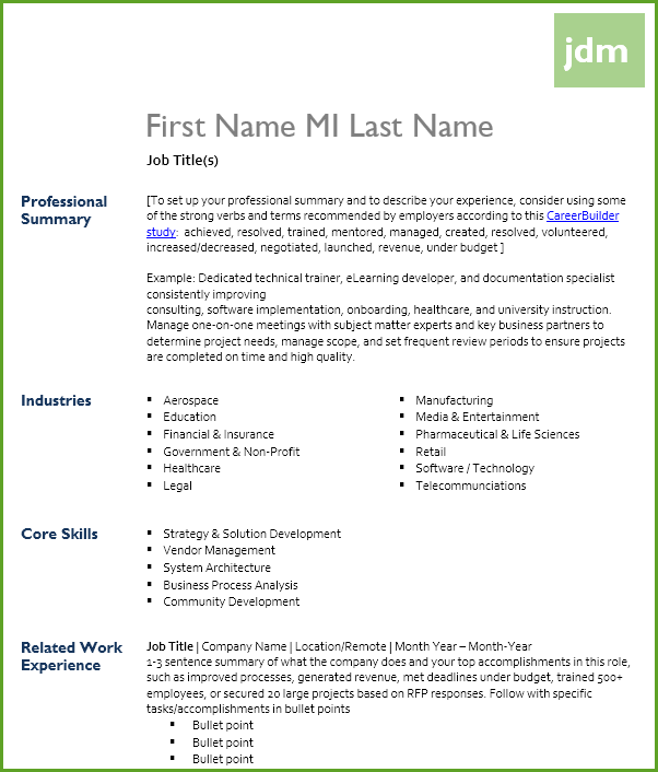
If you’re looking to revamp your resume, you’re in luck. You don’t have to start from scratch. If you like the idea of a simple design element at the top, with headings to the left that are easy to scan, this resume template could be a good fit. It’s a traditional format that recruiters and account managers will be used to seeing, but does stand out with the small design element at the top.
Header – colored block to include your initials
At the top of the resume template, currently set to be in the header, you’ll see a colored block that can house your first initial, middle initial, last initial. Of course, if you just write the first letters there, you end up with “fml” in the box. Look up that acronym/slang word if you want to know why I didn’t write “fml” in the template. 🙂 Instead, I just left my own initials in there.
Customize by putting in your own initials, and of course, you can customize a variety of elements based on your personal brand and design preferences. You can change the color of the box (green), text color (white), font choice (Gill Sans MT), uppercase or lowercase letters, align text differently, and resize the box if you want an exact square, or if you need it bigger to fit all of your initials.
Professional summary – use keywords employers actually like
Included in the professional summary row are some of the top verbs and terms as detailed by CareerBuilder in their survey Hiring Managers Rank Best and Worst Words to Use in a Résumé in New CareerBuilder Survey. Consider refining your summary and experience sections with any relevant keywords these employers prefer to see.
You’ll also see a row for job title(s) so that you can clearly identify your expertise for the role to which you’re applying. It’s good to update titles if you apply for jobs with even a slight variance in titles, or entirely different titles altogether (for example, project manager, communication department manager, and senior human resources professional).
Table setup – easy to customize for core skills, industries, and experience
All of the body text is set up in tables. You can easily add more rows to add as many related jobs as you want, or to add more than one degree or certification. You can also add new row headings to incorporate different types of resume content to fit your personal experience and interests best, including:
- Core skills – if you’ve gleaned some key areas that matter to an employer based on the job ad, you could list your core skills that match up.
- Industries – if you’ve completed projects in a variety of industries, such as finance, aerospace, healthcare, and high tech, you might benefit by listing the various areas you’ve supported.
If you prefer some table borders in there to separate individual entries, feel free to pick a color and add them in.
Make sure the first, middle, last name is displayed on all pages, whether you copy the larger row that includes the name to each page, or if you just keep the name in subsequent pages in the footer.
Footer – to include contact information
I didn’t include a spot for the address right at the top, but you can add that in. You can either add it up front, or add it to the footer if it isn’t as critical to see right away. You can remove the job titles and put the contact info there instead if you prefer. I sometimes choose not to include the address information for one of two reasons:
- I’m posting the resume to several online job boards and don’t feel my address is relevant to recruiters at that point.
- I send out resumes as a contractor and let the current consulting employer add their contact details.
We also have a matching cover letter template. Download it, too!
| This template is free to download and customize for your own use. However, DO NOT REDISTRIBUTE OR REBRAND AS YOUR OWN ORIGINAL DESIGN for posting to online sources or for business profit. |
