3 Tips for Adding Visual Interest to Your Resume (Without Looking Clownish)
Most people would prefer many things, possibly even cleaning out a sock drawer or waking up at 3:00 AM to catch a flight, to writing a resume and searching for a job. You get stressed during the job search; if doesn’t go smoothly, you can feel like you’re trapped on a deserted island. Not surprising that the traditional design and approach to resumes and job searches can feel as confining.
You often won’t see much color or charm related to career development materials, for good reason. Sometimes, job seekers’ approach to adding creativity ends up with flashy circus-like designs that veer too far from a traditional approach, or the one that fits employers’ expectations. Account managers and recruiters receive more applications than ever and have to fill roles quicker, so you need to stand out without looking clownish.
So how do you incorporate modest color and personal to connect with recruiters? It’s possible the advice I share here may differ than what you read elsewhere, and that’s ok. It actually illustrates the point perfectly that some resume design advice is just not going to work for every situation. But I will say that what follows is an approach I’ve always used myself, receiving positive feedback about it’s easy to scan and find pertinent details on my resume within a prettier container than most. For me, that’s a sweet spot to get my resume noticed and gain more interviews.
Stick with Black Text on a White Background
No matter how and where you save and share your resume, don’t try to be clever with the background or font colors. A high amount of contrast between the background and text is easiest for everyone to read, and it’s also what they expect to see. Just stick with a white background and black text for the main body of your content. If you use a colored background for any design elements, you can use a different font color over the top, and you might choose to use an alternative to black for the headings. But use those colors sparingly, and make sure they still have high contrast from the background color.
Examples using white on black, then greenish with black and white text.

Select Blues, Grays, or Similar Colors for Design Elements
Do a simple web search on color connotations, and your results will help you understand branding in general, but the advice might be geared to a specific culture and non-job related materials. There are different inherent meanings assigned based on cultures, but the choices you use on resumes go a step further. Essentially, there are just some colors no one wants to see on your resume, because they don’t convey a “professional” presentation.
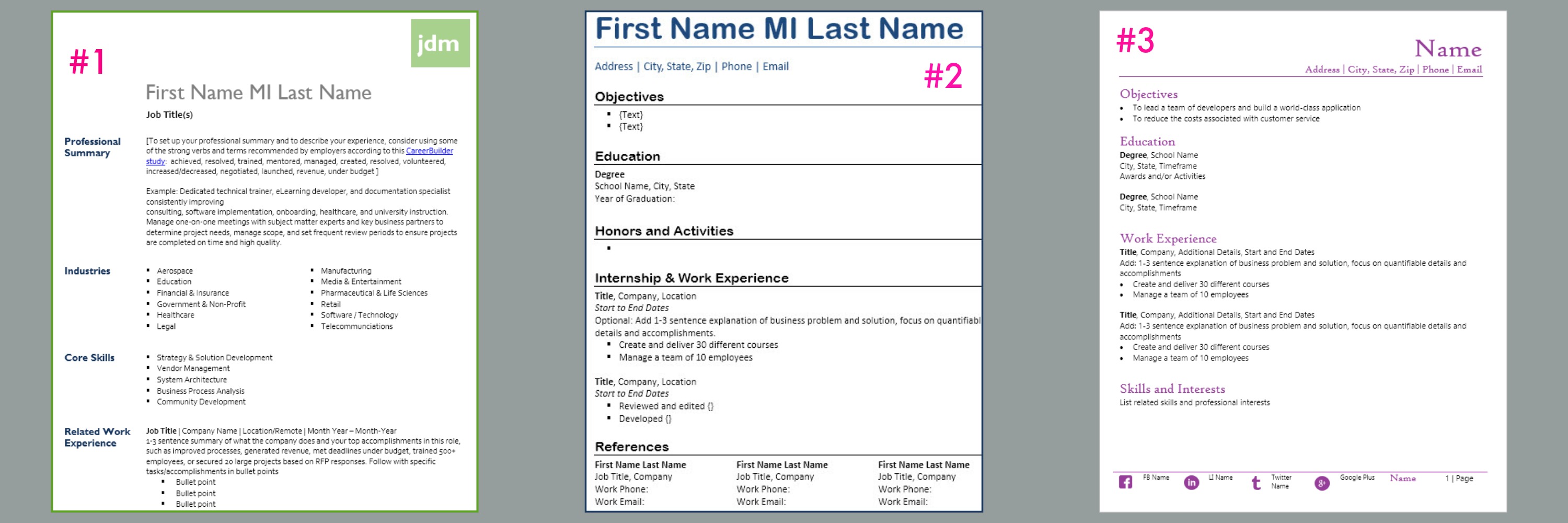
To illustrate this point, I’ve shared an image below that I posted to our social media pages, and my own Facebook page, to see what people thought, at initial glance, about each of these three templates. I asked for which they preferred along with any feedback they wanted to share about any or all three.
Template images shared to social networks for initial feedback.
You know what happened? Almost everyone commented that they’d like the design on number three without that ugly purple font color, followed by how it just wasn’t professional or appropriate for a resume (and a couple people even sad that purple is their favorite color anywhere else). This experiment told me that at least in the traditional industries the people I know work in (education, software, and recruiting), purple was just too non-traditional to be taken seriously.
The safest bet for introducing color is to select one color other than black font and use it for design elements and/or headings, but not all over the page. I’ve seen some recommendations by career experts saying you can use the pop of color in the bullet points, but it’s not where I prefer to use or see color.
Incorporate a graph, chart, social media icons
A modern approach to resume design incorporates visual elements such as graphs, charts, or social media icons to convey a lot of related information quickly and to increase visual appeal. If you’re still in a super traditional role, you may shy away from these approaches. And if you don’t have the real estate, i.e., your resume is already three pages long, don’t bother adding more design unless it can eliminate some of the text.
Another option for sharing your designed graphs and charts is to provide a link from your online-based resume out to your portfolio, which could quickly summarize key accomplishments and skills from your resume without adding more to the actual resume itself.
Example of a CareerManager template using social media icons (you can download it from our Templates page)
Whichever techniques you incorporate to jazz up your resume, make sure they don’t impede you from getting a job! Add color sparingly and thoughtfully, make sure there’s enough color contrast between the background and text, and consider using data-based design elements to
Suggested Resources/Reading:
10 Assumptions You Make That Kill Your Resume
A Glimpse And A Hook: Confessions Of A Hiring Manager

