When Looks Matter: You Can Judge a (Resume) Book by Its Cover

I read a lot, and in the past year, I’ve been able to scratch this itch by signing up for daily notifications from Bookbub sharing low-cost and free e-books that I can download. Because I have so many books in both ebook and print form, I try to keep my spending to a limit, only purchasing in cash money, the new books from authors I already enjoy or topics I can’t ignore.
So as I go through the 5-10 listed books in each daily email notification, I’m starting to recognize a pattern in what grabs my attention and ultimately makes me download any particular book. The first thing I scan for is FREE.

image credit: https://images.gr-assets.com/hostedimages/1437247344ra/15557956.gif
Second, I quickly glance at the title and genre to analyze my likely interest (for example, I prefer mysteries over romance). Third, and probably a key deciding factor, is that I scope out the cover art. If it looks cheap or like someone I could’ve had my 5-year-old design with her crayons, or looks like clip art, I’m probably done. At that point, I’ve decided the author’s lack of professionalism means they’re just not as into getting their book read as they should be.
Is that a fair analysis? Probably not. But it doesn’t matter, because I’m one of many who probably then think it’s not as good as something with better cover art. Was the author too cheap to pay for a good designer? Is the book going to have a lame plot and be riddled with cliches or typos?
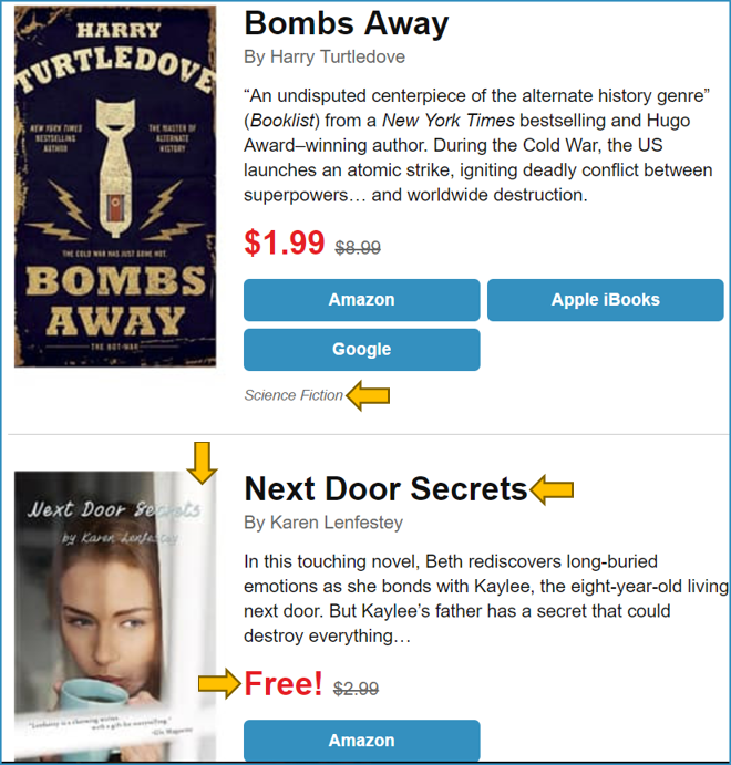
Here’s an example of the email I get from Bookbub, with various parts in the order I take a look. Note, I think both covers are designed well, so they’re not ones I’d then judge as poor books.
Since this is a career management blog, you’re probably now wondering how I’m connecting this to resumes. So here you go. The first impression you make to a potential employer is highly determined by what your resume looks like. You can think that’s unfair, but it’s true. If your “cover art” isn’t as good as the resume lying next to yours, it might get thrown into the “no” pile before they can even be wowed by any of your unique skills and experiences.
The good news is, you don’t need to be a document designer or graphic designer, or even hire a resume designer to get your resume into good enough shape to feel confident when you hand it off.
Your resume is one chapter of the storybook you put together to impress recruiters and hiring managers. Without a good storybook, you’re selling yourself short.
5 Simple Design Tips that Work (and don’t require you to be a design expert)
Contact information
Make it big. Include all information someone needs to contact you easily if the context requires it, or if you’re just posting to online job boards (not to a specific position), at least include your name, and again, large enough to see easily. Add it to every page in the resume, cover letter, or other career-related document. And make sure it’s your current address, email, etc.
Topic headings
Use them to make each section stand out, which makes it easy for the recruiter to quickly scan and find pertinent details. If you have to make them work for it, to understand your format, they’ll quickly move onto someone else. Headings can be in a different font, bold, bigger, different color, or using similar design tactics, to stand out.
Bullet points
Use bullet points to call out the persuasive accomplishments you have for a specific role. Each bullet point should cover one clear element, and don’t go too many levels in (one to two levels of indentation is usually best). Avoid the numbered lists because they are meant to indicate an order of importance or steps; just put your most important detail at the top of the list without changing the format from bullets.
Proximity
Make sure you space your headings closely to the content areas they introduce. And put more space at the end of each section before the next one starts. By spacing appropriately, you make it easy for anyone reviewing to see what text connects to each heading, job title, or degree. You want reviewers to quickly connect the dots, not have to decipher how it all works together.
White space
Make sure you have some white space, or margin around the edges of all your text, and also put some in between sections of the resume. Cramming too much text onto the page is too busy and seems daunting to even attempt to read.
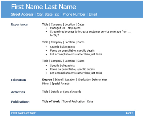
Example with contact information big and bold, headings different color and size + easy to scan